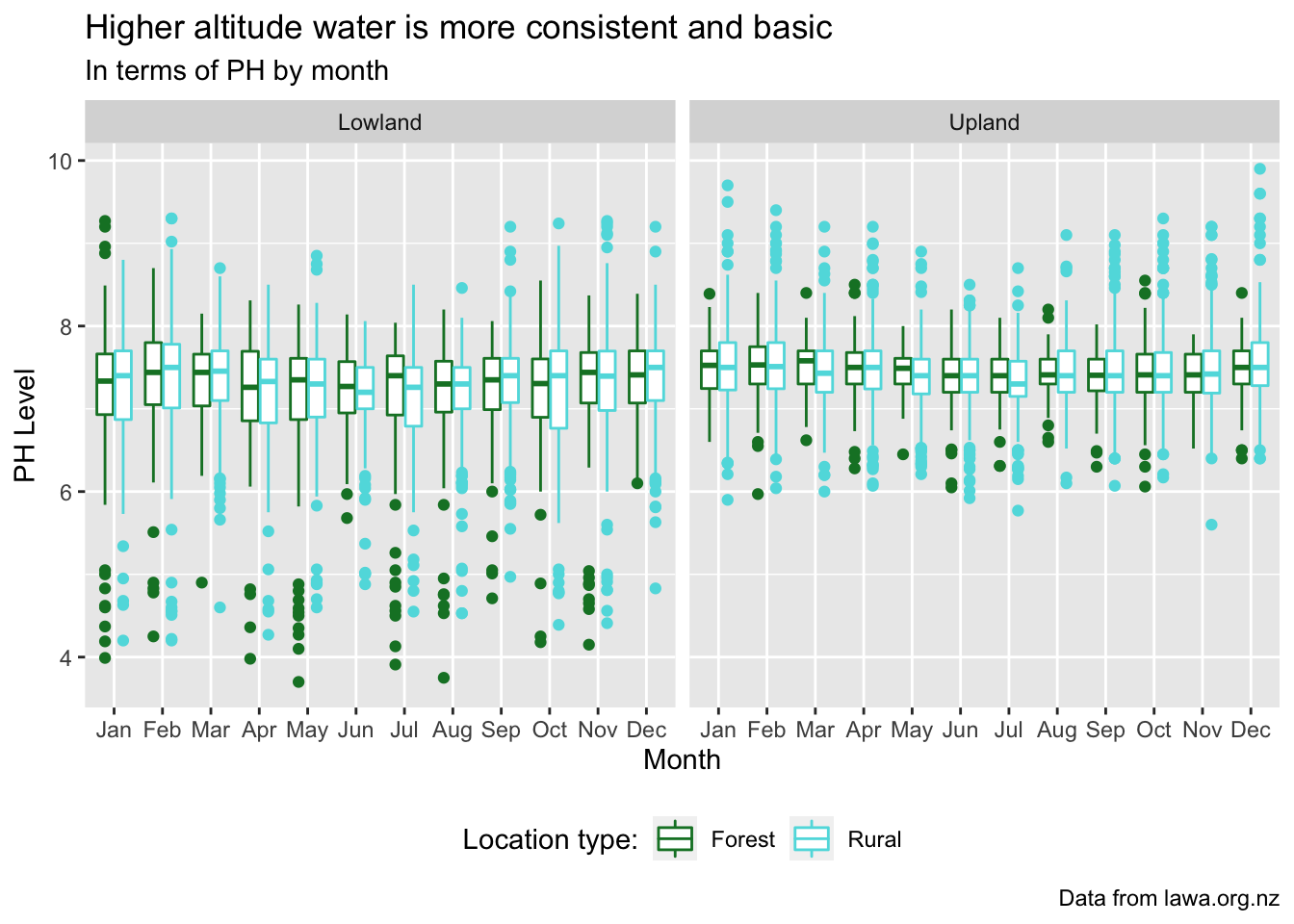
My story shoes the correlation between the spread of PH readings per site per month. I decided a boxplot would show spread best due to the quartile split with the extreme points shown individually and more specifically. I think it shows the difference in spread for both forest and rural locations fairly nicely, without having so many datapoints it’s impossible to read. I also made sure to compare both the altitude and location type/landuse as I figure that limits the variation due to other potential underlying factors. I opted to not use any mean summaries of the values as it gives a much more accurate show that even with the extreme values still able to appear, the spreads are considerably different for the center. It also shows that there are significant amount of values much much lower than the average in lowland, while the measurements in upland are not as varied.
library(tidyverse)
library(lubridate)

lawa <- read_csv("http://www.massey.ac.nz/~jcmarsha/161122/LAWA/lawa94.csv")
lawaClean <- lawa %>%
  filter(SWQLanduse != "NA", PH != "NA") %>%
  group_by(SiteID, Month = month(Date, label=TRUE), SWQLanduse, SWQAltitude) %>%
  summarize(PH)

lawaClean %>%
  ggplot(mapping=aes(x=Month, y=PH, colour=SWQLanduse)) +
  scale_colour_manual(values = c(Forest = "#12802f", Rural = "#5edce0")) +
  geom_boxplot() +
  facet_wrap(vars(SWQAltitude)) +
  theme_gray()+
  theme(legend.position = "bottom", legend.direction="horizontal") +
  labs(y="PH Level", x="Month", colour="Location type:", caption = "Data from lawa.org.nz",
       title="Higher altitude water is more consistent and basic", subtitle="In terms of PH by month")