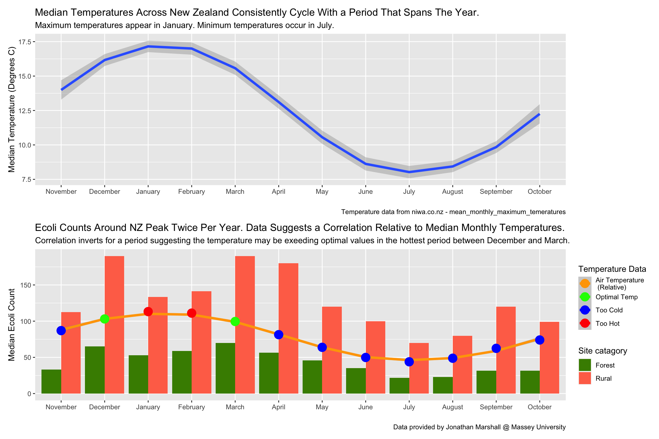
I choose to tell a story about the relationship between E.coli and ambient temperatures. While probing the data I noticed a yearly cyclic trend. Temperature seemed the obvious choice that also cycles throughout the year but also tends to have a substantial affect on chemical reaction and cell reproduction speeds. I found some data online and weaved it into the project.
I tried many ways of arranging and displaying the data. I went with methods that focused on 2 aspects. It needed to look pleasing to the eye but also make the relationship I was focusing on as obvious as possible. I was also forced to use 2 different plot types because I wanted to superimpose a relative trend on top of the actual measured data. This is also why I started with just the temperature plot which allows the viewer to see the values associated with the trend before I superimposed it without values.
What I came up with is a graph that shows the correlation between E.coli counts and ambient temperature throughout the year. I show evidents that suggests an optimal temperature and that deviations from this optimal temperature in either direction correlates with a reduced E.coli count.
library(tidyverse)
library(lubridate)
library(patchwork)

# Read in data specific to my student ID
lawa <- read_csv("http://www.massey.ac.nz/~jcmarsha/161122/LAWA/lawa16.csv")

# Read in monthly temperature data for various locations in NZ.
NZTemps_Original <- as.data.frame(read_csv("https://niwa.co.nz/sites/niwa.co.nz/files/sites/default/files/mean_monthly_maximum_temperatures_deg_c.csv", skip = 3))

# Wrangle and tidy temperature data.
NZTemps_Clean <- NZTemps_Original %>%
  # Remove NA cells.
  na.omit() %>%
  # Remove useless columns.
  select(-c(1, 14)) %>%
  # Rename columns.
  rename(January = X2, February = X3, March = X4, April = X5, May = X6, June = X7, July = X8, August = X9, September = X10, October = X11, November = X12, December = X13) %>%
  # Remove data from antarctic Scotts base.
  filter(January > 0)

# Remove top row.
NZTemps_Clean = NZTemps_Clean[-1,]

# Final tidy on temperature data to get median per month of all areas combined.
NZTemps_Monthly_Medians <-  NZTemps_Clean %>%
  # Tidy
  pivot_longer(values_to = 'Temp', names_to = 'Month', cols = 1:12) %>%
  # Transform string to a number so median can be calculated.
  mutate(Temp = as.numeric(Temp)) %>%
  # Summarise to give median for each month.
  group_by(Month) %>%
  summarise(mTemp = median(Temp))

# factor month column so it appears in order where possible, starting with October to show season progression better.
NZTemps_Monthly_Medians$Month <- factor(NZTemps_Monthly_Medians$Month, levels = c("November", "December", "January", "February", "March", "April", "May", "June", "July", "August", "September", "October"))

#-----------------

# Wrangle E.Coli data to investigate by month.
lawa_New <- lawa %>%
  # Selecting only useful columns for intended investigation.
  select(SiteID, SWQLanduse, Date, ECOLI) %>%
  # Add specific column for month.
  mutate(Month = months(Date)) %>%
  # Join with dataset containing median monthly air temperature.
  left_join(NZTemps_Monthly_Medians) %>%
  # Filter out Urban because data seemed too different likely due to unnatural environment.
  # Forest and Rural areas have similar trends so sticking to them.
  # Factors could be greater proximity from populated areas and fewer un-natural structures.
  filter(SWQLanduse != 'Urban') %>%
  # Ignore useless rows with NA...
  # was under the impression NA might mean less than 1 but couldn't find the explanation again so disregarded it.
  na.omit()
# Could have filled NAs with 0 using below code... decided to stick with omit.
# complete(SiteID, SWQLanduse, Date, fill = list(ECOLI=1))

# factor month column so it appears in order where possible, starting with October to show sin wave better.
lawa_New$Month <- factor(lawa_New$Month, levels = c("November", "December", "January", "February", "March", "April", "May", "June", "July", "August", "September", "October"))

#-----------------

# Plot to show median temperature highs across NZ, monthly
plot1 = NZTemps_Monthly_Medians %>%
  ggplot()+
  geom_smooth(aes(x = Month, y = mTemp, group = 1), size = 1.5)+
    labs(title = 'Median Temperatures Across New Zealand Consistently Cycle With a Period That Spans The Year.',
       subtitle = 'Maximum temperatures appear in January. Minimum temperatures occur in July. ',
       y = 'Median Temperature (Degrees C)',
       x = '',
       caption = 'Temperature data from niwa.co.nz - mean_monthly_maximum_temeratures')

#-----------------


plot2 = lawa_New %>%
# summarise median over all occasions of each month (dodge version).
  group_by(Month, SWQLanduse, mTemp) %>%
  summarise(mECOLI = median(ECOLI, na.rm = TRUE)) %>%
  # adding indicator to show too hot or cold to show my best guess.
  mutate(Status = ifelse(Month == 'December' | Month == 'March', 'Optimal Temp', ifelse(Month == 'January' | Month == 'February', 'Too Hot', 'Too Cold'))) %>%
# plot year by monthly medians.
ggplot()+
  # Specifying colour order for lines and fills.
  scale_color_manual(values=c('orange', 'green', 'blue', 'red'))+
  scale_fill_manual(values=c('chartreuse4','coral1'))+
  # column plot to show nice curve but also to stand apart from temperature smoothed to come.
  geom_col(aes(x = Month,
               y = mECOLI,
               fill = SWQLanduse), position = 'dodge')+
  labs(title = 'Ecoli Counts Around NZ Peak Twice Per Year. Data Suggests a Correlation Relative to Median Monthly Temperatures.',
       subtitle = 'Correlation inverts for a period suggesting the temperature may be exeeding optimal values in the hottest period between December and March.',
       y = 'Median Ecoli Count',
       x = '',
       caption = 'Data provided by Jonathan Marshall @ Massey University',
       fill = 'Site catagory',
       col = 'Temperature Data')+
  # Smooth line showing relative trend of temperature changes through the year.
  # multiplied to shape the curve to to match the graph, adding to raise or lower it into pleasing position.
  geom_smooth(aes(x = Month, y = mTemp*7-10, group = 1, col = 'Air Temperature \n (Relative)'), size = 1.5)+
  # colour coded points to show where I think it is optimal temperatures or too hot/cold.
  geom_point(aes(x = Month, y = mTemp*7-10, col = Status), span = 0.5, size = 5)

#-----------------

# summarise median over all occasions of each month (stack version).
plot3 = lawa_New %>%
  # summarise median over all occasions of each month.
  group_by(Month, SWQLanduse, mTemp) %>%
  summarise(mECOLI = median(ECOLI, na.rm = TRUE)) %>%
  # adding indicator to show my speculation about being optimal or too hot / cold.
  mutate(Status = ifelse(Month == 'December' | Month == 'March', 'Optimal Temp', ifelse(Month == 'January' | Month == 'February', 'Too Hot', 'Too Cold'))) %>%
# plot year by monthly medians.
ggplot()+
  # Specifying colour order for lines and fills.
  scale_color_manual(values=c('orange', 'green', 'blue', 'red'))+
  scale_fill_manual(values=c('chartreuse4','coral1'))+
  # column plot to show nice curve but also to stand apart from temperature smoothed to come.
  geom_col(aes(x = Month,
               y = mECOLI,
               fill = SWQLanduse), position = 'stack')+
  labs(title = 'Ecoli Counts Around NZ Peak Twice Per Year. Data Suggests a Correlation Relative to Median Monthly Temperatures.',
       subtitle = 'Correlation inverts for a period suggesting the temperature may be exeeding optimal values in the hottest period between December and March.',
       y = 'Median Ecoli Count',
       x = '',
       caption = 'Data provided by Jonathan Marshall @ Massey University',
       fill = 'Site catagory',
       col = 'Temperature Data')+
    # Smooth line showing relative trend of temperature changes through the year.
    # multiplied to shape the curve to to match the graph, adding to raise or lower it into pleasing position.
  geom_smooth(aes(x = Month, y = mTemp*20, group = 1, col = 'Air Temperature \n (Relative)'), span = 0.5, size = 1.5)+
  # colour coded points to show where I think it is optimal temperatures or too hot/cold.
  geom_point(aes(x = Month, y = mTemp*20, col = Status), span = 0.5, size = 5)

#-----------------

# patch those beauties together.
plot1 / plot2
#plot1 / plot3