I first started by looking at the data and plotting the different variables to see what it was like. I didn’t really know what I wanted to study yet. I grouped the data so I could see the different stations I had been assigned. I had hoped to get a single basin or river and its affluents so I could study water quality as we were going down the river, but the stations I had were quite scattered across different rivers so that wasn’t possible. Then I thought of comparing upland and lowland per land use but I realised that I only had one urban upland station, and that is not sufficient data to compare with the other categories.
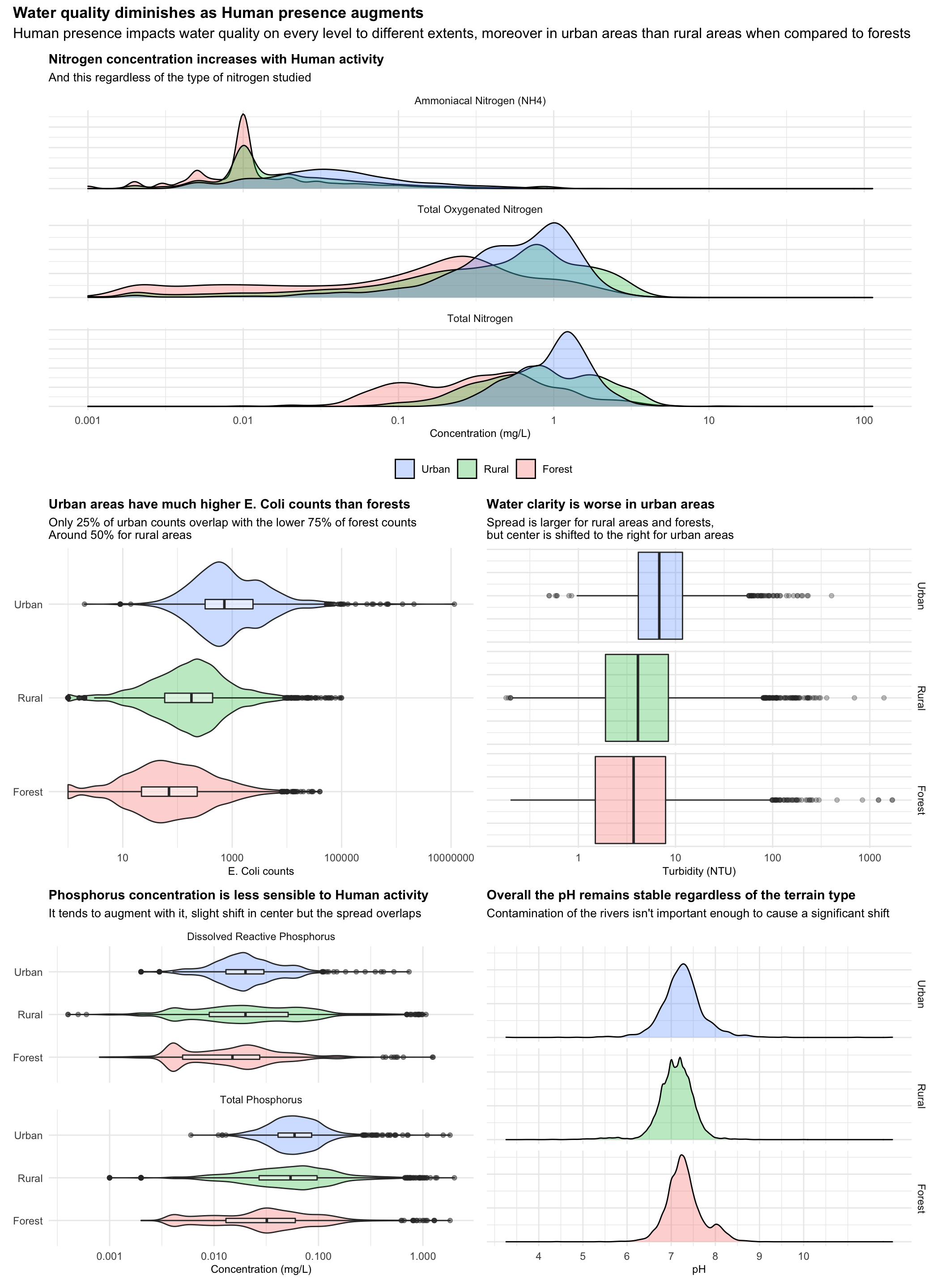
So I plotted the nitrogen plot seen in the final plot (at first in a more basic form than the one presented) and saw the marked right shift of the density when we compared human presence areas (urban and rural) to the more human free environment of the forest. I decided I would compare how much human activity affected the different water quality criteria. I tried all four plots for all variables : histogram, density, boxplot, violin and boxplot ; and picked the clearest one. I discovered the violin plot while this project and I find it is a very nice way of getting a feel for the range and shape while still getting the median and main quartiles on the same plot thanks to the associated boxplot. I decided to use turbidity over black disc measures because the shift was clearer on the turbidity plot.The formatting of each individual plot was long and tedious, but the hardest part was figuring out how to make the five plots work together. At first I couldn’t get them in a way that they were all readable, but in the end I figured it out with the fig.dim parameter.
Overall I am happy with the plot I made, even if I still feel maybe studying something else would have been better. I still find it somewhat tells a clear story, and I am just sad I do not have enough knowledge in water quality to truly understand the meaning and conclusions to take about those charts.
library(tidyverse)
library(patchwork)
library(knitr)

lawa <- read_csv("http://www.massey.ac.nz/~jcmarsha/161122/LAWA/lawa13.csv")

lawa_all_uses <- lawa %>%
#  group_by(SWQLanduse) %>%
  select(-Lat,-Long,-SiteID,-Date,-SWQAltitude)

labs_n <- c(NH4 = "Ammoniacal Nitrogen (NH4)",TON = "Total Oxygenated Nitrogen",TN = "Total Nitrogen")

lawa_n_plot <- lawa_all_uses %>%
  pivot_longer(c(NH4,TON,TN),names_to="NType",values_to="NVal") %>%
  mutate(NType=fct_relevel(NType,"NH4","TON","TN")) %>%
  ggplot()+
  geom_density(aes(NVal,fill=SWQLanduse),alpha=0.3)+
  facet_wrap(vars(NType),ncol=1,scales = "free_y",labeller = labeller(NType = labs_n))+
  scale_x_log10(breaks = c(0.001,0.01,0.1,1,10,100),labels=c("0.001","0.01","0.1","1","10","100"))+
  theme_minimal()+
  labs(title = "Nitrogen concentration increases with Human activity",subtitle="And this regardless of the type of nitrogen studied",fill=NULL,y=NULL,x="Concentration (mg/L)")+
  guides(y="none",fill = guide_legend(reverse=TRUE))+
  theme(plot.title = element_text(size=11,face="bold"),plot.subtitle = element_text(size = 10),axis.title.x = element_text(size = 9), legend.position = "bottom")

labs_p <- c(DRP = "Dissolved Reactive Phosphorus",TP = "Total Phosphorus")

lawa_p_plot <- lawa_all_uses %>%
  pivot_longer(c(TP,DRP),names_to="PType",values_to="PVal") %>%
  ggplot()+
  geom_violin(aes(PVal,SWQLanduse,fill=SWQLanduse),alpha=0.3)+
  geom_boxplot(aes(PVal,SWQLanduse),width=0.1,alpha=0.5)+
  facet_wrap(vars(PType),ncol = 1,labeller = labeller(PType = labs_p))+
  scale_x_log10()+
  theme_minimal()+
  labs(y=NULL,x="Concentration (mg/L)",title = "Phosphorus concentration is less sensible to Human activity",subtitle = "It tends to augment with it, slight shift in center but the spread overlaps",fill=NULL)+
  guides(fill = "none")+
  theme(plot.title = element_text(size=11,face="bold"),plot.subtitle = element_text(size = 10),axis.title.x = element_text(size = 9))

lawa_ecoli_plot <- lawa_all_uses %>%
  ggplot()+
  geom_violin(aes(ECOLI,SWQLanduse,fill=SWQLanduse),alpha=0.3)+
  geom_boxplot(aes(ECOLI,SWQLanduse),width=0.1,alpha=0.5)+
  scale_x_log10(breaks = c(10,1000,100000,10000000),labels= c("10","1000","100000","10000000"))+
  labs(x="E. Coli counts",y=NULL,fill=NULL,title="Urban areas have much higher E. Coli counts than forests",subtitle = "Only 25% of urban counts overlap with the lower 75% of forest counts\nAround 50% for rural areas")+
  theme_minimal()+
  guides(fill = "none")+
  theme(plot.title = element_text(size=11,face="bold"),plot.subtitle = element_text(size = 10),axis.title.x = element_text(size = 9))

lawa_turb_plot <- lawa_all_uses %>%
  arrange(desc(SWQLanduse)) %>%
  ggplot()+
  geom_boxplot(aes(TURB,fill=SWQLanduse),alpha=0.3)+
  facet_grid(vars(as_factor(SWQLanduse)))+
  scale_x_log10()+
  guides(y="none",fill ="none")+
  labs(x="Turbidity (NTU)",title = "Water clarity is worse in urban areas",subtitle = "Spread is larger for rural areas and forests,\nbut center is shifted to the right for urban areas",fill=NULL)+
  theme_minimal()+
  theme(plot.title = element_text(size=11,face="bold"),plot.subtitle = element_text(size = 10),axis.title.x = element_text(size = 9))

lawa_pH_plot <- lawa_all_uses %>%
  filter(14>=PH,PH>=0) %>%
  arrange(desc(SWQLanduse)) %>%
  ggplot()+
  geom_density(aes(PH,fill=SWQLanduse),alpha=0.3)+
  facet_grid(vars(as_factor(SWQLanduse)))+
  labs(title = "Overall the pH remains stable regardless of the terrain type",x="pH",y=NULL,subtitle = "Contamination of the rivers isn't important enough to cause a significant shift",fill=NULL)+
  guides(y="none",fill="none")+
  theme_minimal()+
  scale_x_continuous(breaks = c(4,5,6,7,8,9,10))+
  theme(plot.title = element_text(size=11,face="bold"),plot.subtitle = element_text(size = 10),axis.title.x = element_text(size = 9))


lawa_n_plot/(lawa_ecoli_plot +lawa_turb_plot)/(lawa_p_plot+lawa_pH_plot)+
plot_annotation(title = "Water quality diminishes as Human presence augments",subtitle = "Human presence impacts water quality on every level to different extents, moreover in urban areas than rural areas when compared to forests", theme = theme(plot.title = element_text(size = 13,face = "bold"),plot.subtitle = element_text(size = 12)))