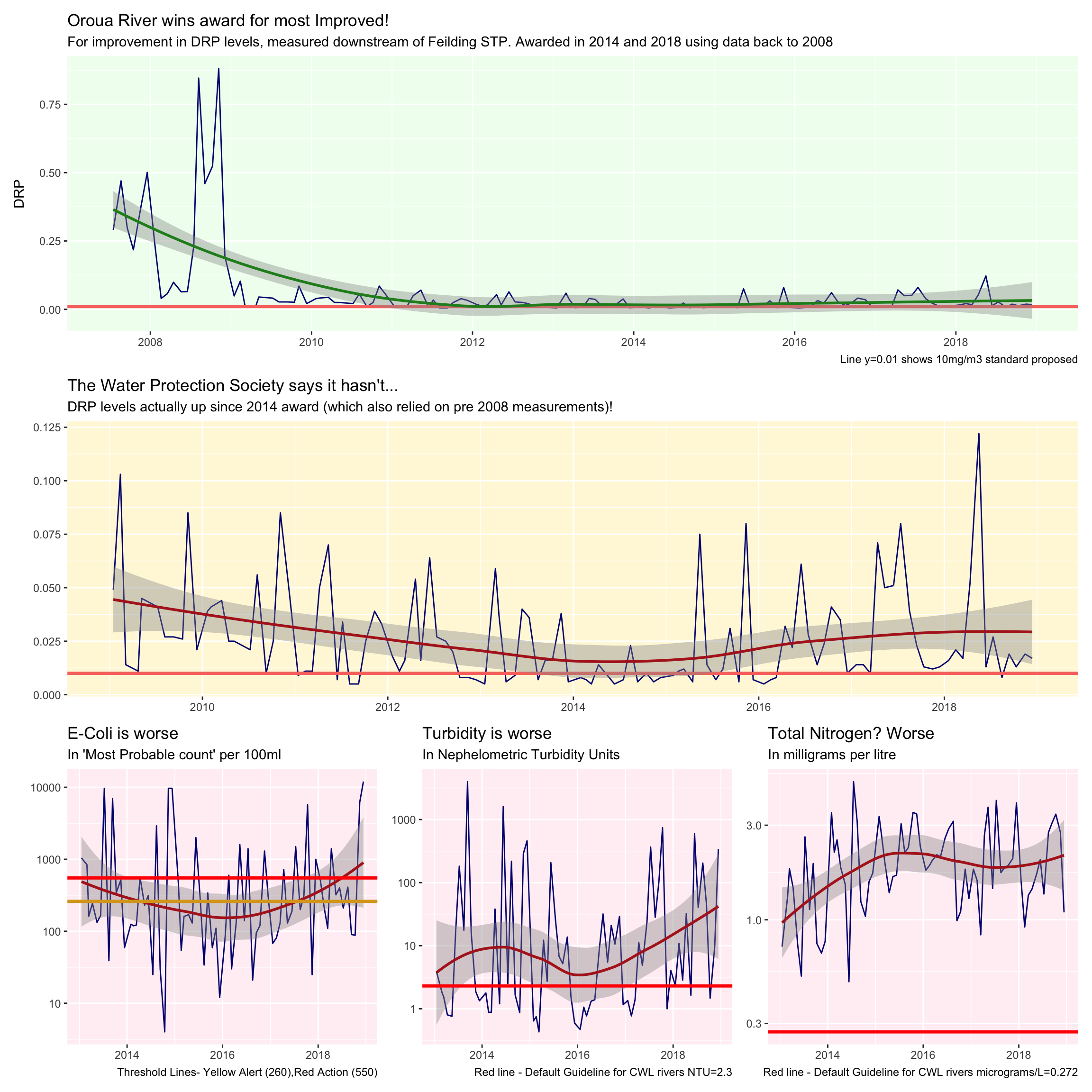
In 2018, The Oroua River was recognised a second time for most improved river, the first being in 2014 (1). A panel of scientists use data available from Land Air Water Aotearoa (LAWA), and has come under some criticism we should understand - firstly they are accused by The Water Protection Society(2) of cherry picking their data and using only one of four key measures to make their judgement at only one measurement site on the river AND to make matters worse, they have included an outlier - the Feilding Sewerage Treatment Plant measured, changed their treatment methods in 2008 a way that would dramatically reduce the measured Dissolved Reactive Phosphorous. In fact since the Oroua river was awarded River of the Year in 2014 for the same said improvement, WPS asserts that it has got worse by LAWA’s own measurement.
I am going to investigate, using what should be the same data (considering it’s the same source!) - are the Water Protection Society making noise for noises sake, or have they made a valid point? I will use charts to show
- That the outlier included in the ‘River of the Year’ data has clouded the data
- That in fact The WPS are right - it is worse by the same measure that was awarded (opposite of what should have happened)
These two charts are line charts displayed one above the other, showing clearly trend over time with a smoothing line. This is the easiest way to view the trend over this time period. The chart also contains a comparison to the Horizon council’s own proposed DRP standards.
- That three other critical measures of Water Quality are also worse
(2)https://www.scoop.co.nz/stories/PO1811/S00325/oroua-river-doesnt-deserve-award.htm (1)http://www.horizons.govt.nz/news/oroua-river-recognised-at-new-zealand-river-awards
https://enm.org.nz/directory/water-protection-society
library(tidyverse)
library(lubridate)
library(patchwork)

lawa <- read_csv("http://www.massey.ac.nz/~jcmarsha/161122/LAWA/lawa44.csv")

#for graph one and two
DRPovertime <- lawa %>% filter(SiteID == "oroua at d/s feilding stp") %>% select(SiteID,Date,DRP)
#for graphs three four five
fourfactorssince2014 <- lawa %>% filter(SiteID == c("oroua at d/s feilding stp")) %>% select(SiteID,Date,DRP,TURB,ECOLI,TN) %>% filter(Date>"2013-01-01")
isitthetreatmentplant <- lawa %>% filter(SiteID == c("oroua at d/s feilding stp","oroua at u/s feilding stp")) %>% select(SiteID,Date,DRP,TURB,ECOLI,TN) %>% filter(Date>"2014-01-01")


awardcomparison <- ggplot(DRPovertime,aes(Date,DRP)) +
  geom_line(colour="navy")+
  geom_hline(aes(yintercept=.01,colour="red"),size=1.2)+
  geom_smooth(colour="forestgreen")+
  labs(title="Oroua River wins award for most Improved!",subtitle="For improvement in DRP levels, measured downstream of Feilding STP. Awarded in 2014 and 2018 using data back to 2008",caption="Line y=0.01 shows 10mg/m3 standard proposed")+
  theme(axis.title.x=element_blank(),legend.position = "none",panel.background = element_rect("honeydew"))

WPScomparison <- DRPovertime %>% filter(Date>"2009-01-01") %>% ggplot(aes(Date,DRP))+
  geom_line(colour="navy")+
  geom_hline(aes(yintercept=.01,colour="red"),size=1.2)+
  geom_smooth(colour="firebrick")+
  labs(title="The Water Protection Society says it hasn't...",subtitle="DRP levels actually up since 2014 award (which also relied on pre 2008 measurements)!")+
  theme(axis.title=element_blank(),legend.position = "none",panel.background = element_rect("cornsilk"))


ECOLIgraph <- ggplot(fourfactorssince2014,aes(x=Date,y=ECOLI)) +
  geom_line(colour="navy")+
  geom_smooth(colour="firebrick")+
  geom_hline(aes(yintercept=260),colour="goldenrod",size=1.2)+
  geom_hline(aes(yintercept=550),colour="red",size=1.2)+
  scale_y_log10()+
  labs(title="E-Coli is worse",subtitle="In 'Most Probable count' per 100ml",caption="Threshold Lines- Yellow Alert (260),Red Action (550)")+
  theme(axis.title=element_blank(),panel.background = element_rect("lavenderblush"))

TURBgraph <- ggplot(fourfactorssince2014,aes(x=Date,y=TURB),panel.background = element_rect("lavenderblush")) +
  geom_line(colour="navy")+
  geom_smooth(colour="firebrick")+
  geom_hline(aes(yintercept=2.3),colour="red",size=1.2)+
  scale_y_log10()+
  labs(title="Turbidity is worse",subtitle="In Nephelometric Turbidity Units",caption="Red line - Default Guideline for CWL rivers NTU=2.3")+
  theme(axis.title=element_blank(),panel.background = element_rect("lavenderblush"))

TNgraph <- ggplot(fourfactorssince2014,aes(x=Date,y=TN)) +
  geom_line(colour="navy")+
  geom_smooth(colour="firebrick")+
  geom_hline(aes(yintercept=0.272),colour="red",size=1.2)+
  scale_y_log10()+
  labs(title="Total Nitrogen? Worse",subtitle="In milligrams per litre",caption="Red line - Default Guideline for CWL rivers micrograms/L=0.272")+
  theme(axis.title=element_blank(),panel.background = element_rect("lavenderblush"))


(awardcomparison)/(WPScomparison)/(ECOLIgraph |TURBgraph | TNgraph)