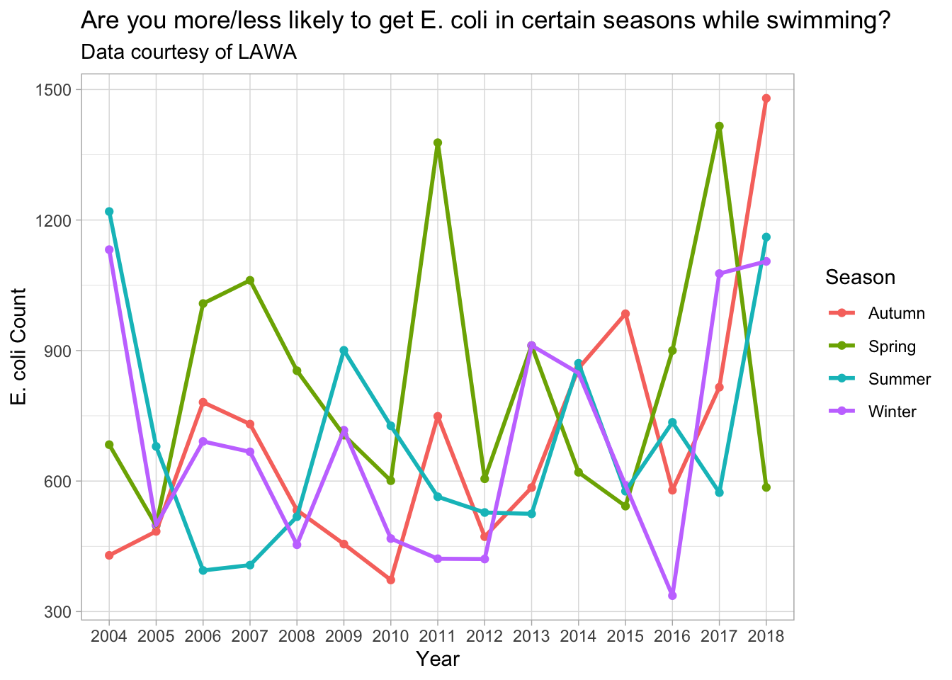
The story I wanted to tell is whether you are more likely or less likely to infected by E. coli while swimming (or drinking) from the sites provided in the data. I chose this story as I thought it would be relatively unique, but also easy to represent at the same time, I also wanted to know if there was a correlation here just out of interest.
I chose to combine a geom_point and geom_line graph to represent the data as I believe it is the best way to show the correlation between E. coli counts and season. I included Year as the X axis variable while despite not being directly related to the question, it can provide insight into potential outliers (e.g. was there an E. coli outbreak in 2011 spring) as well as provide data on if the counts are always close or further apart every year - is summer higher than winter one year and vice versa the next year?
As a side part - while not directly related to the graph, you can also notice that the max mean counts are actually in 2017-2018, which makes you wonder - are we getting better at measuring for E. coli or were there more outbreaks and why?
Putting them all on the same graph allows for easy comparison of different points using the grid lines as a guide.
- I removed the top 1% of data as there were a lot of massive E. coli counts that are likely errors on the measurer’s part. This created a lot of outliers if not filtered correctly
- I used mean() to also reduce this error
- I didn’t change any theme colours because I thought the original colours ggplot chose worked great for the seasons
The graph shows that there is no clear correlation between E. coli count for Summer, Winter and Autumn, however Spring tended to be higher than the rest on most years. Though from the data I would conclude that Spring tends to have higher counts than the other 3, though this is not always the case - potentially there is a higher chance of outbreak in Spring, though this may not always happen every year (as seen in 2015/2018, where the others are higher).
Overall - are you more or less likely to get E. coli in certain seasons while swimming? Yes, though the difference in chance is likely quite small to the point where it is negligible. So, if you want to be super safe while swimming, swim in areas specifically set out for swimming by the government or local authorities.
library(tidyverse)

lawa <- read_csv("http://www.massey.ac.nz/~jcmarsha/161122/LAWA/lawa46.csv")

seasons = function(x){
  # Based on Meteorological Seasons, not Astronomical
  case_when(
    x == 12 ~ "Summer",
    x <= 2 ~ "Summer",
    x <= 5 ~ "Autumn",
    x <= 8 ~ "Winter",
    x <= 11 ~ "Spring"
  )
}

formatted_data <- lawa %>% filter(ECOLI < quantile(na.omit(ECOLI), 0.99)) %>% mutate(Year = substr(Date, 0, 4), Season = seasons(as.numeric(substr(Date, 6, 7)))) %>% group_by(Year, Season) %>% summarise(ECOLI = mean(na.omit(ECOLI)))


ggplot(data = formatted_data, mapping = aes(x=Year, y=ECOLI, color=Season, group=Season)) +
  geom_point() +
  geom_line(size = 1) +
  labs(title="Are you more/less likely to get E. coli in certain seasons while swimming?", subtitle="Data courtesy of LAWA") +
  ylab("E. coli Count") +
  theme_light()