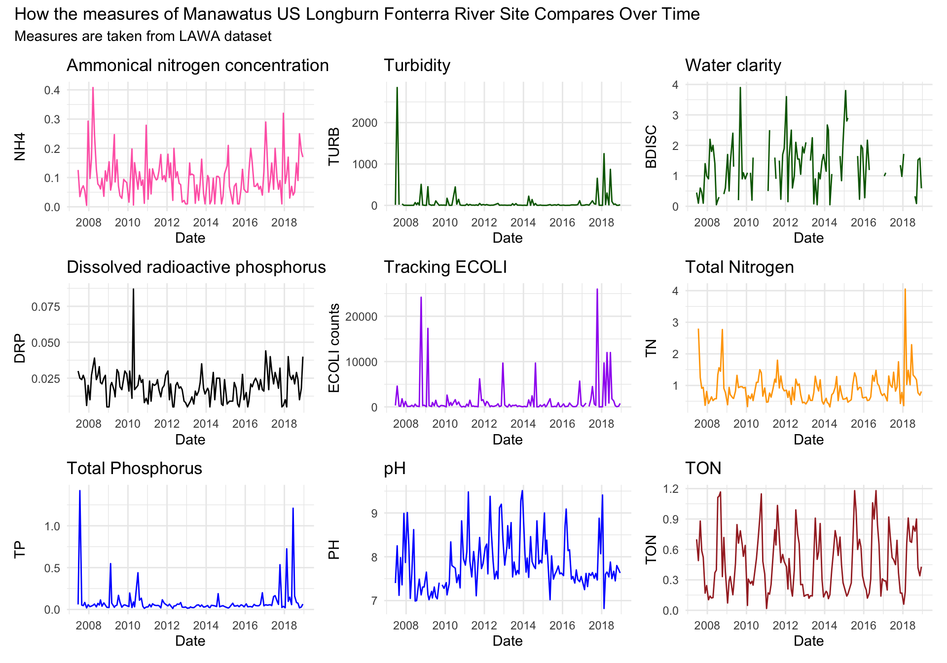
I chose to filter my data to gather data for rural lowland Manawatu at us Fonterra site. I chose to specifically do Fonterra as Fonterra is a large company in New Zealand, and I was interested in seeing how the river quality of river measures in the Manawatu Fonterra region compare and look like. Fonterra is a major export company in New Zealand, so seeing the surrounding river quality of Fonterra faired with the image of a sustainability and a clean image. Fonterra is also where I would like to work in the future, so seeing these water quality measures were interesting and gave me insight to the river quality. Particularly, I was interested in the ECOLI count measure in the river spanning over many years. Around 2009 and 2018, there are 2 big spikes in ECOLI count, surpassing 20000, while the other years remain relatively consistent with each year. These 2 spikes in years 2009 and 2018 are the only data points that reach over 20000. I also found it interesting that when I compared the dates, the 2018 spike occurred almost a decade later, and double the 2009 year. Obviously something occurred during these two years to cause this large increase in ECOLI count compared to years ranging 2007-2018 (11 years). For my graphs I decided to use line graphs. Line graphs are effective for showing changing distance over short and long periods of time. As my data takes place over many years, I decided that line graphs would be the most effective way of showing the changes in each measure over a period of time. Line graphs can be used to compare multiple groups at the same time, and this is more effective than using, say, histograms, bar graphs or point graphs. Line graphs really show the change over time and change from date to date in an easy-to-read, orderly fashion. I decided to patch all of my singular graphs together to give the reader/viewer a better understanding of the change in each measure over time. During the start of the each graph, for a majority of the individual measures, there is a noticeable spike around 2008-2010. This is interesting to me as this points an idea of a significant event that lead to this increase in counts for these measures. After doing some research I found that an increasing ECOLI measure, for example, is alarming as ECOLI counts in a river can be a sign of other pathogens from human or animal faeces in water surrounding fonterra’s river site. My patchwork graph shows the comparison of every measure changing over time (2007-2018) for the rural lowland Manawatu at us Fonterra site. I decided that using patchwork was better for displaying my graphs all in one page as it is easier to read, as opposed to showing each graph individually. Using patchwork really allows easy comparison between each measure, rather then having to individually view each measure. The data taken from LAWA and was filtered specifically for this site.
library(tidyverse)
library(lubridate)

lawa <- read_csv("http://www.massey.ac.nz/~jcmarsha/161122/LAWA/lawa39.csv")

  ## QUESTION: How is the river at the site 'Manawatu at us fonterra longburn' changing over time with each measure?

## Comparing one fonterra site with all of the measures
## Run individually first to see closeups of the change over time

Fonterra_SiteID <- filter(lawa, SiteID == "manawatu at us fonterra longburn") %>%
  select(SiteID, Date, NH4, TURB, DRP, BDISC, ECOLI, TN, TP, TON, PH)

S1=ggplot(data=Fonterra_SiteID) +
  geom_line(mapping=aes(x=Date, y=NH4), col = 'hot pink') +
  theme_bw() + theme_minimal() +
  labs(title= "Ammonical nitrogen concentration",
       y = "NH4", x = "Date")

S2=ggplot(data=Fonterra_SiteID) +
  geom_line(mapping=aes(x=Date, y=TURB), col = 'dark green')+
  theme_bw() + theme_minimal() +
  labs(title= "Turbidity",
       y = "TURB", x = "Date")

S3=ggplot(data=Fonterra_SiteID) +
  geom_line(mapping=aes(x=Date, y=BDISC), col = 'dark green')+
  theme_bw() + theme_minimal() +
  labs(title= "Water clarity",
       y = "BDISC", x = "Date")

S4=ggplot(data=Fonterra_SiteID) +
  geom_line(mapping=aes(x=Date, y=DRP), col = 'black')+
  theme_bw() + theme_minimal() +
  labs(title= "Dissolved radioactive phosphorus",
       y = "DRP", x = "Date")

S5=ggplot(data=Fonterra_SiteID) +
  geom_line(mapping=aes(x=Date, y=ECOLI), col = 'purple')+
  theme_bw() + theme_minimal() +
  labs(title= "Tracking ECOLI",
       y = "ECOLI counts", x = "Date")

S6=ggplot(data=Fonterra_SiteID) +
  geom_line(mapping=aes(x=Date, y=TN), col = 'orange')+
  theme_bw() + theme_minimal() +
  labs(title= "Total Nitrogen",
       y = "TN", x = "Date")

S7=ggplot(data=Fonterra_SiteID) +
  geom_line(mapping=aes(x=Date, y=TP), col = 'blue')+
  theme_bw() + theme_minimal() +
  labs(title= "Total Phosphorus",
       y = "TP", x = "Date")

S8=ggplot(data=Fonterra_SiteID) +
  geom_line(mapping=aes(x=Date, y=PH), col = 'blue')+
  theme_bw() + theme_minimal() +
  labs(title= "pH",
       y = "PH", x = "Date")

S9=ggplot(data=Fonterra_SiteID) +
  geom_line(mapping=aes(x=Date, y=TON), col = 'brown')+
  theme_bw() + theme_minimal() +
  labs(title= "TON",
       y = "TON", x = "Date")

## Patching all individual graphs for each measure together into one graph
library(patchwork)
S1 + S2 + S3 + S4 + S5 + S6 + S7 + S8 + S9 +
  plot_annotation(title = "How the measures of Manawatus US Longburn Fonterra River Site Compares Over Time",
                  subtitle = "Measures are taken from LAWA dataset")