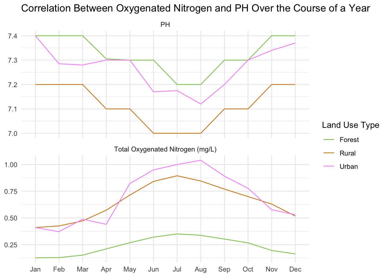
Hello! I really wanted to do a data story about nitrogen, as I did an assignment last semester on the effects of dairy farming on nitrogen in waterways. I was curious to see the impact that the different types of land use have on oxygenated nitrogen. I found it hard to graph the daily median, got a lot of spikes, I think due to data not being present for every site for every day. Ended up aggregating by month and only covering one year, which gave much more consistent data. It might be illegal to do line graphs for discrete points but seemed clear and easy to understand. These graphs show a couple of interesting things. The most interesting for me was the winter spike in nitrogen, and how the PH levels also lower. I read that was supposed to happen on the LAWA site, but was cool to see in practice. I also thought it was interesting to see how much of an impact rural and urban areas have on nitrogen and PH levels. I don’t think my rural areas were overly rural, maybe there would be more of a distinction on farmland.
library(tidyverse)
library(lubridate)

lawa <- read_csv("http://www.massey.ac.nz/~jcmarsha/161122/LAWA/lawa15.csv")

summarised_ph_and_nitrogen = lawa %>%
  group_by(Month=month(Date), SWQLanduse) %>%
  summarise(TotalOxygenatedNitrogen=median(TON, na.rm=TRUE), PH=median(PH, na.rm=TRUE)) %>%
  pivot_longer(c('TotalOxygenatedNitrogen', 'PH'), names_to='Indicator', values_to='Value')

ggplot(summarised_ph_and_nitrogen, aes(x=Month, y=Value, col=SWQLanduse)) +
  geom_line() +
  facet_wrap(
    vars(Indicator),
    scales='free_y',
    dir='v',
    labeller=as_labeller(c(PH='PH', TotalOxygenatedNitrogen='Total Oxygenated Nitrogen (mg/L)'))
  ) +
  scale_x_discrete(limits=month.abb) +
  scale_color_manual(values=c(Forest='#91c966', Urban="#f39af9", Rural='#d38b2c')) +
  labs(
    title='Correlation Between Oxygenated Nitrogen and PH Over the Course of a Year',
    col='Land Use Type',
    y=NULL,
    x=NULL
  ) +
  theme_minimal() +
  theme(axis.title.x = element_text(margin=margin(t=10)))